Project Type
Art Direction
Role
Lead Brand & UX Designer
Skills
Design Thinking, UX & Brand Design, Martketing
Transforming Canadian Democracy Through Strategic Design
Project Overview
Smart Voting is a non-partisan platform that empowers Canadian voters to make informed strategic decisions during elections. As the 2025 federal election approached, the platform needed a comprehensive brand refresh and website redesign to better serve Canada's progressive and centrist voters while scaling to reach millions of users.
Timeline: Pre-2025 Federal Election
Team: Collaborative effort with social media manager and junior designer
The Problem
The original Smart Voting site, while functional, faced several critical usability and brand perception challenges:
Dark Theme Limitations: The purple-dominant dark interface, while visually striking, created accessibility barriers and potentially intimidated casual users
Logo Underperformance: Simple white checkmark logo lacked brand personality and memorability in the crowded political information space
Navigation Friction: Large regional flag cards on homepage created visual clutter and required multiple clicks to reach relevant information
Data Presentation Issues: Basic bar charts without strategic voting context made it difficult for users to understand tactical voting implications
Technical Constraints: Missing location services, SEO optimization, and comprehensive analytics
The original Smart Voting website.
The Solution
Logo Evolution
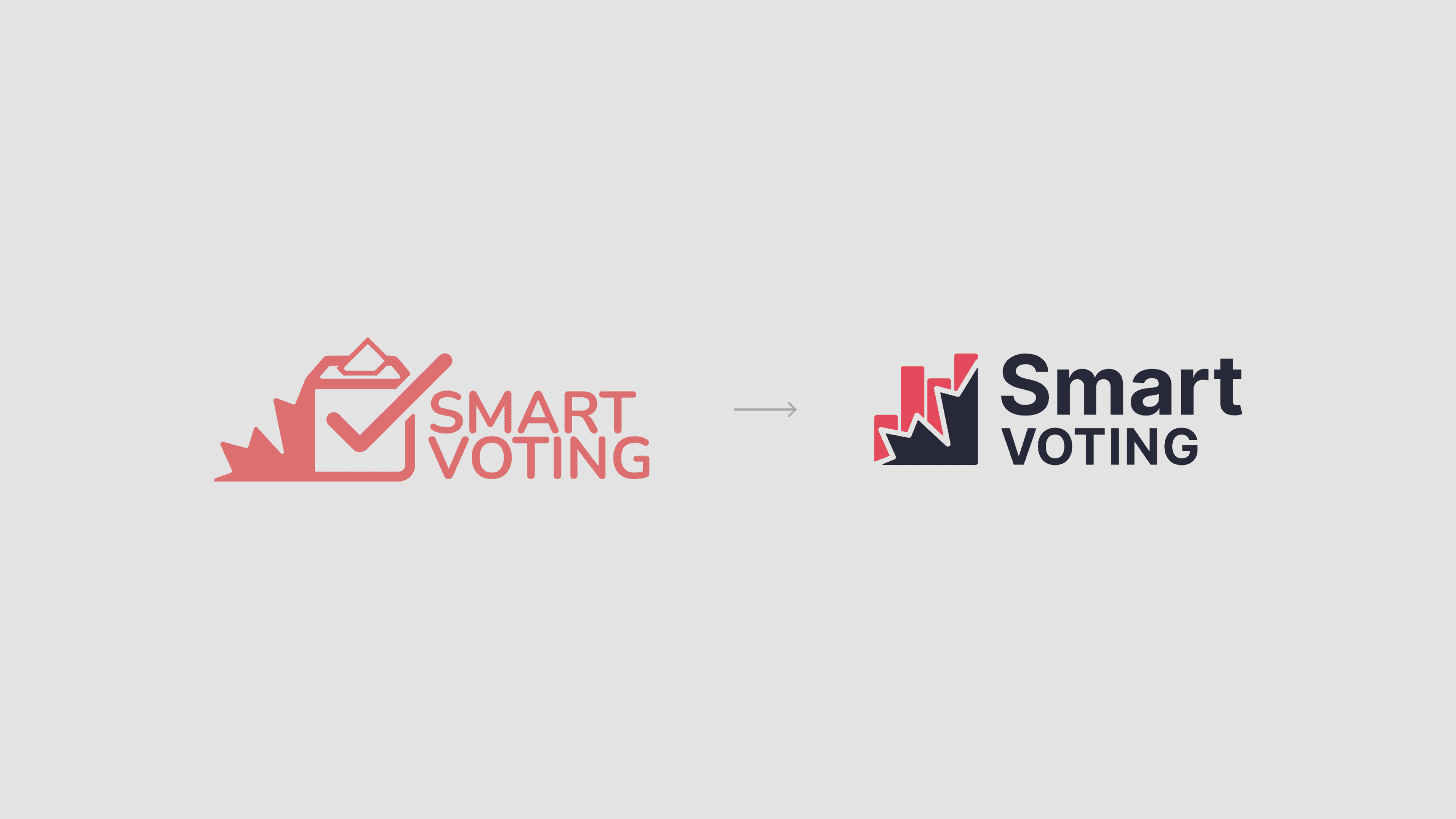
The new logo maintains the voting metaphor while adding visual weight and memorability. The evolution from a purely functional mark to a distinctive brand symbol reflects the platform's growth from a basic tool to a comprehensive democratic engagement platform.
Brand Values Integration
Fun: Approachable design that makes political engagement accessible
Educational: Clear information hierarchy and intuitive data presentation
Transparent: Open communication about methodology and data sources
Innovative: Modern digital experience that leads the civic tech space
Old vs. New Smart Voting Logo.
Visual Transformation
Theme Evolution: Shifted from dark purple-dominated interface to clean, light theme improving readability and user comfort
Layout Optimization: Replaced large regional flag cards with efficient dropdown navigation, reducing visual clutter and improving task completion speed
Enhanced Data Visualization: Transformed basic horizontal bar charts into comprehensive, interactive visualizations.
UI Consistency: Implemented cohesive design system across all riding charts and data presentations, replacing inconsistent styling
Improved Hierarchy: Created clearer information architecture with better visual flow and user guidance
Old vs. New Riding Charts
Visual Data Enhancement
Transformed static projections into interactive, comprehensive charts
Implemented consistent visual design system across all data visualizations
Trust & Credibility Features
Added dedicated section explaining data algorithm methodology
Integrated location-based functionality for personalized user experience
Improved individual riding chart UI for consistency and clarity
Hi-fidelity wireframes of the Smart Voting website.


