Project Type
Art Direction
Role
Art Director/Lead Designer
Skills
Figma, Wireframes, Prototyping, Branding, UX/UI, Marketing
EBlock Brand Evolution: Scaling Digital Identity for Market Expansion
Project Overview
EBlock needed to evolve from a startup auction platform to an established industry leader as they expanded services and entered new markets. The brand and digital presence required strategic repositioning to reflect their growth and sophisticated service offerings.
The Strategic Challenge
Business Context
EBlock expanded from a simple digital auction tool to a comprehensive dealer ecosystem with physical auction partnerships, new services, and North American market presence.
Brand Positioning Gap
Current perception: Scrappy startup with basic digital tools
Target perception: Established industry leader with comprehensive solutions
Market requirements: Professional credibility to compete with established auction houses like Manheim and ADESA
Digital Presence Problems
Single-page website couldn't communicate service breadth or complexity
Inconsistent visual identity across digital touchpoints undermined professional credibility
Outdated aesthetic didn't reflect company's technological innovation and market position

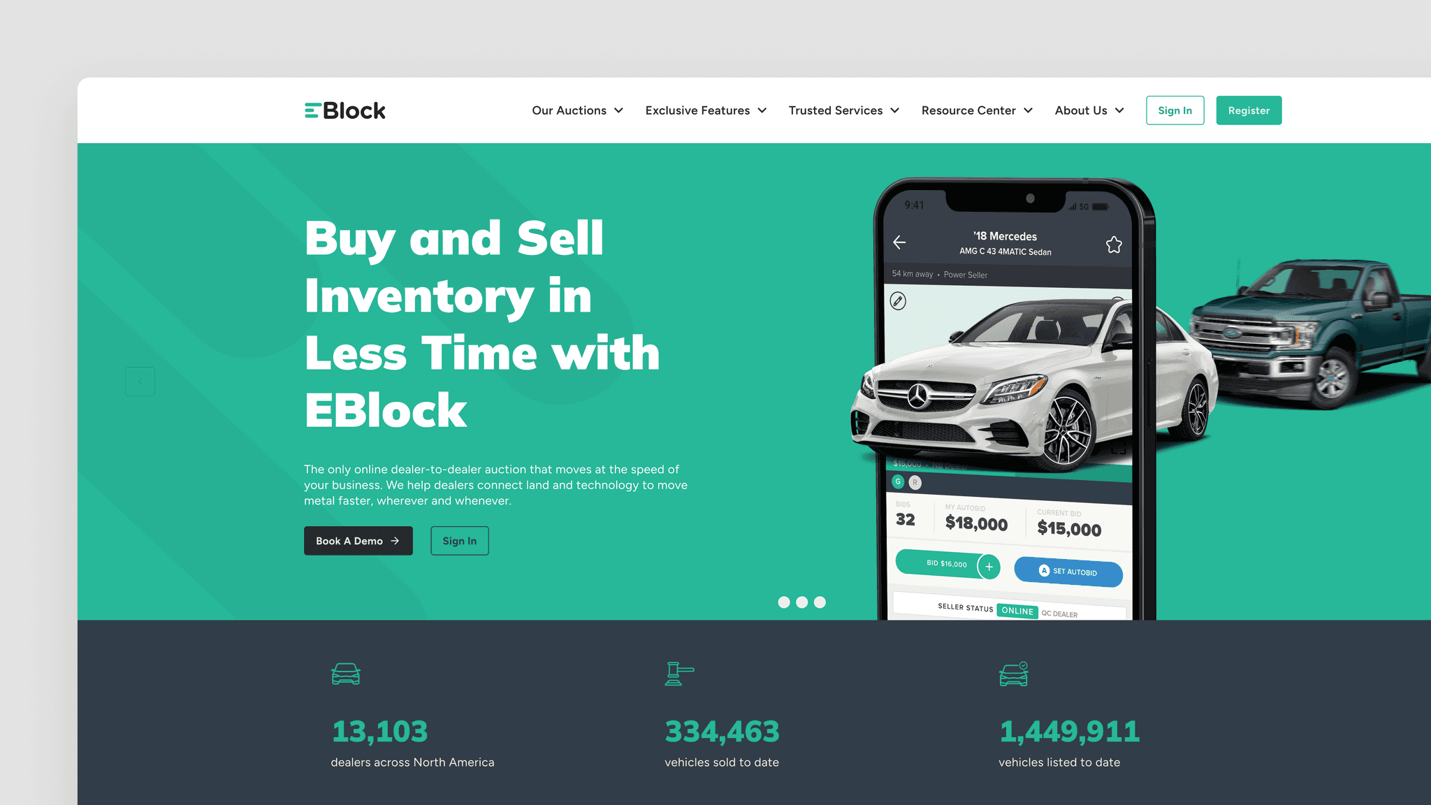
The original website.
Creative Strategy
Brand Positioning
"Technology Meets Tradition": positioning EBlock as the platform that brings automotive auction industry expertise into the digital age.
Visual Strategy Pillars
Professional Authority: Compete visually with established auction industry leaders
Technological Innovation: Reflect cutting-edge platform capabilities while respecting industry traditions
Accessibility: Maintain approachable brand personality that welcomes dealers of all sizes
The Process
Color Palette Rationalization
Reduced from 6 to 2 primary colors for stronger brand recognition and easier implementation
Elevated green as primary brand color connecting to growth, money, and "go" signals in auctions
Yellow as energetic accent reflecting speed and urgency of auction environment
Maintained familiar elements to preserve brand equity, especially in established U.S. market
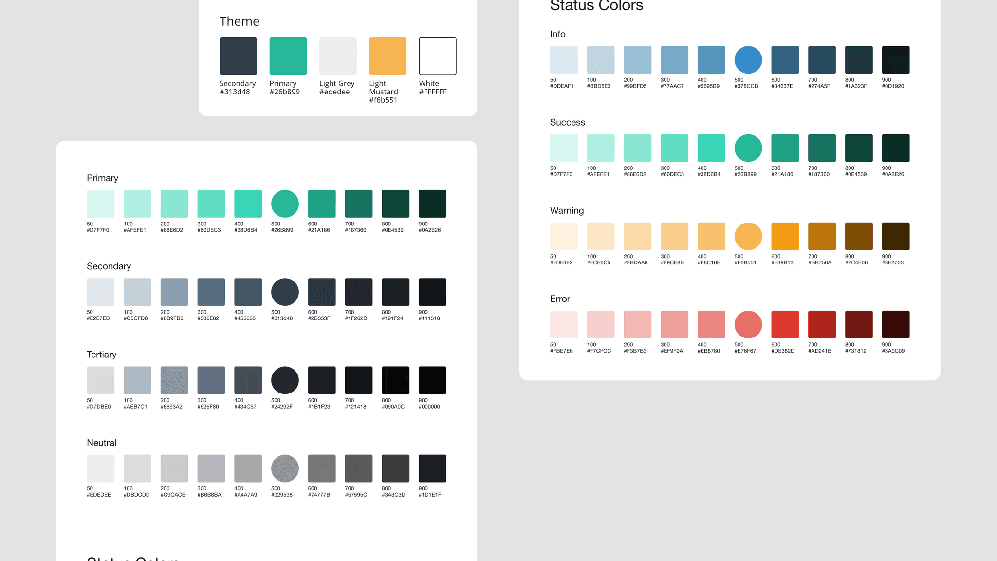
The updated brand colours include status colours for added flexibility.
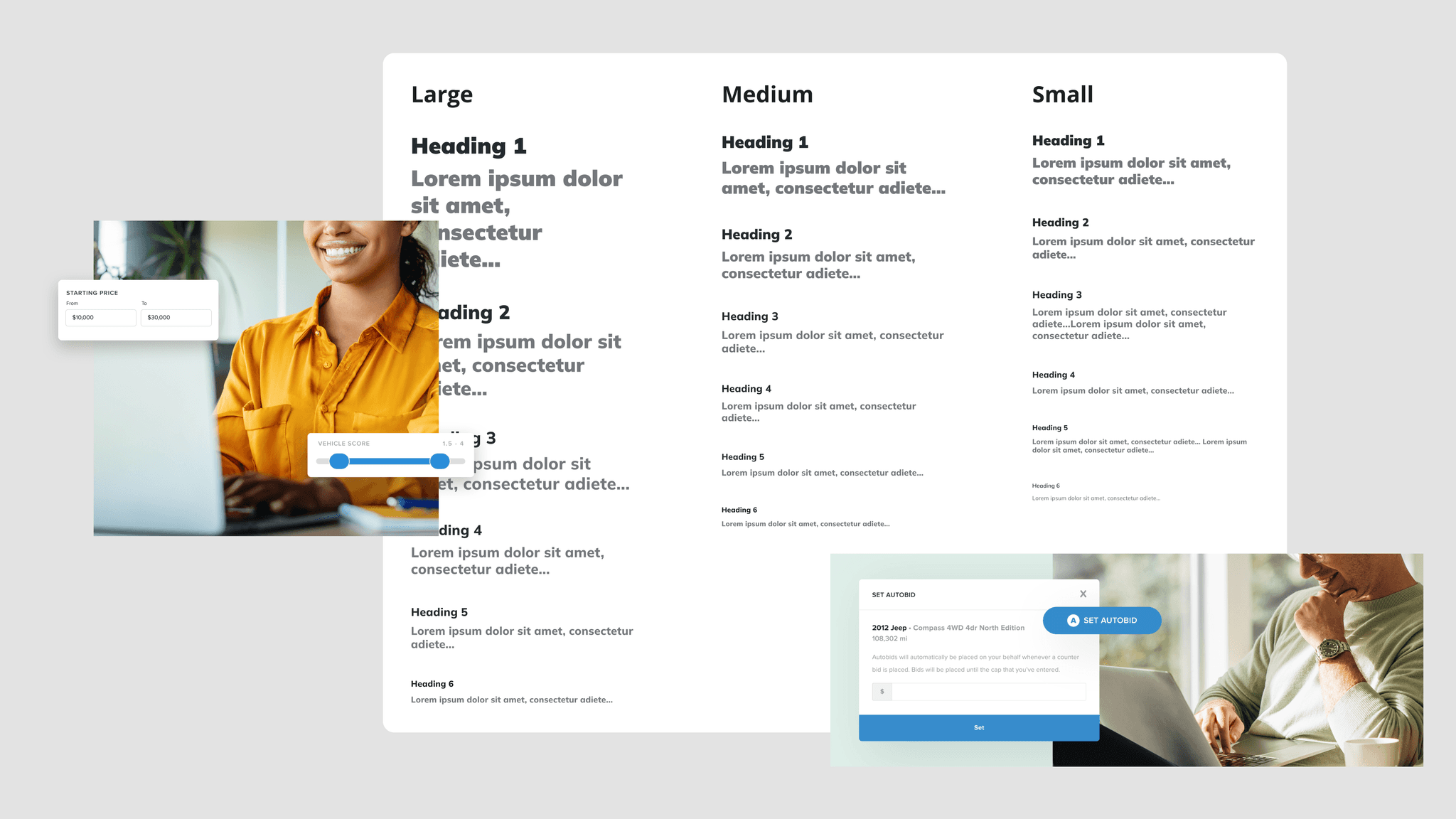
Typography Strategy
Shifted from Proxima Nova to Mulish for technical reliability across web platforms
Maintained similar personality to preserve brand recognition while improving performance
Created typographic hierarchy supporting both marketing and product interface needs
Component Design Philosophy
Modular system approach allowing consistent brand expression across multiple touchpoints
Scalable visual elements supporting business growth without constant redesign
Cross-platform consistency from website to product interface to print materials
Information Architecture & Design Strategy
From Single-Page to Multi-Page Architecture
Strategic content organization reflecting service complexity and user journey needs
Clear navigation hierarchy guiding different user types (existing dealers, prospects, partners)
Scalable content framework accommodating new services and regional expansion
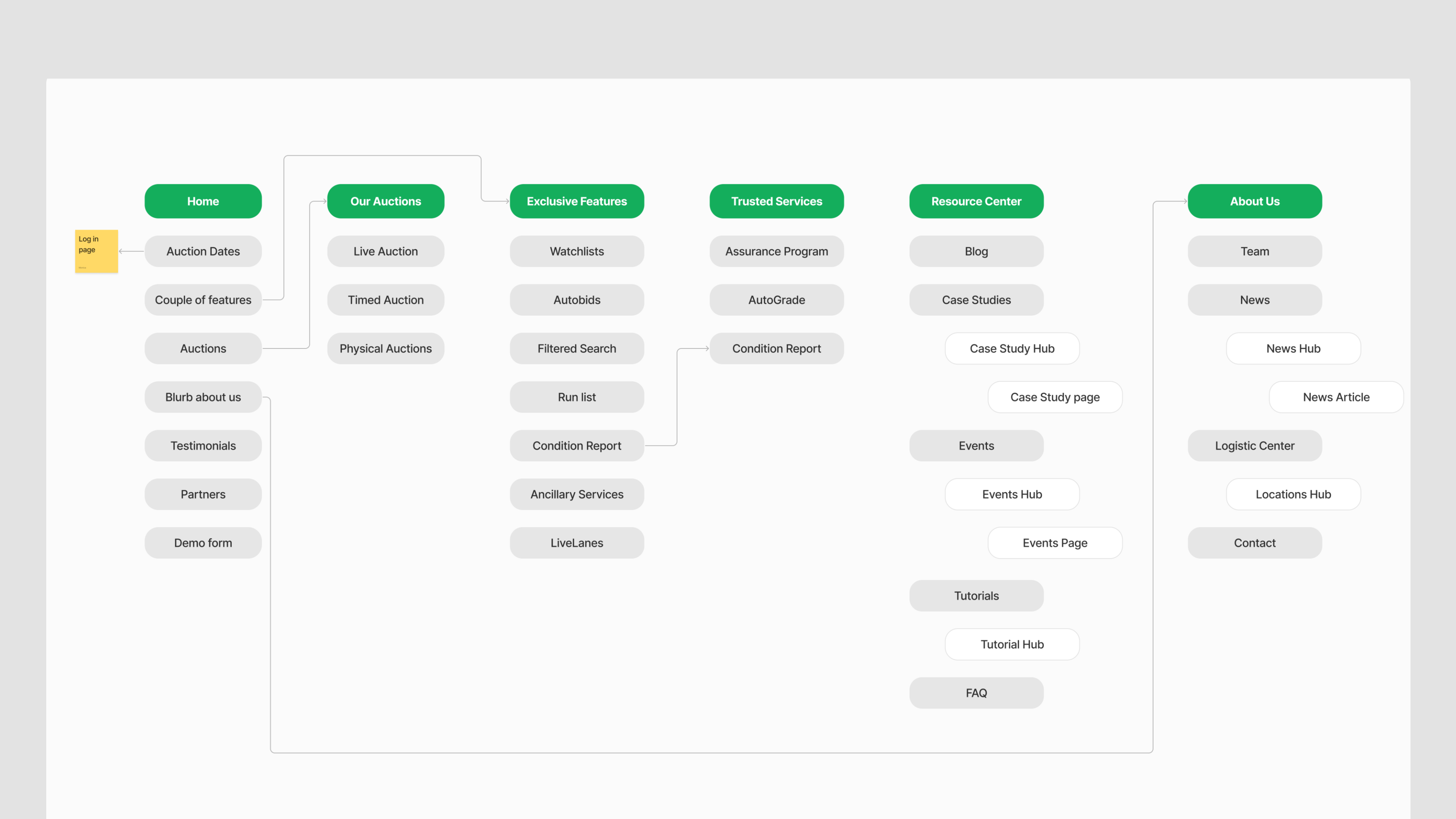
Flow chart of the EBlock website architecture.
Modular Component Strategy
Auction Details Cards:
Consistent information hierarchy for schedule, location, and access details
Strong visual affordances for clickable elements and primary actions
Responsive behavior maintaining functionality across device sizes
Service Highlight Modules:
Flexible content framework supporting various service types and descriptions
Visual consistency while allowing content customization
Scalable design system accommodating new service launches

Responsive design to ensure optimal experience in all platforms.
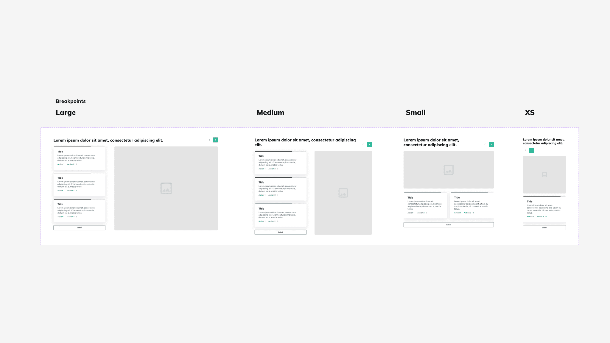
Fully customizable components with editable content and imagery.
Technical Implementation Leadership
Comprehensive design specifications including character limits, responsive breakpoints, and interaction states
Component documentation ensuring consistent implementation across pages
Quality assurance guidelines maintaining design integrity through development process
Results and Impact
Brand Strength Improvements
Consistent professional identity across all digital touchpoints
Improved brand recognition through simplified and memorable visual system
Enhanced credibility supporting enterprise sales conversations
Digital Presence Enhancement
Scalable website architecture supporting business growth without redesign needs
Improved user experience through clear information organization and navigation
Mobile-optimized experience serving field-based dealer needs
Marketing Effectiveness
Aligned visual language across website, social media, print, and product interfaces
Flexible brand system supporting various marketing campaigns and initiatives
Professional presentation enabling competition with established industry players

High fidelity wireframes of the home page, auctions page, and resource center.

High fidelity wireframes of the news article, case study template, and about us page.